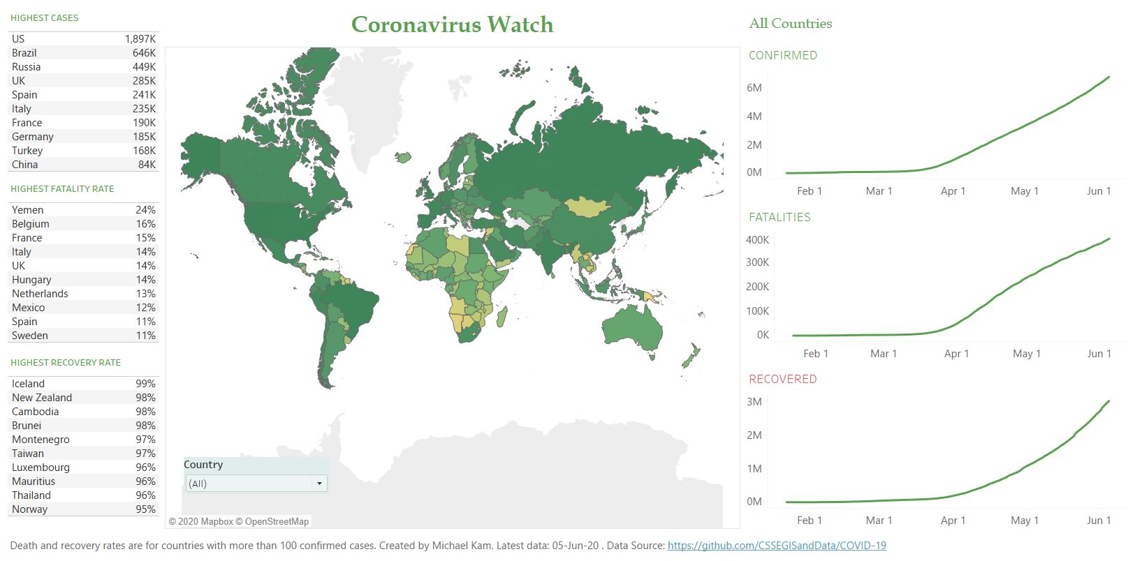
Back in March, I discovered that John Hopkins University (JHU) has made a public dataset on COVID-19 cases globally. At that time, there were only several countries affected by the outbreak. However, as we have known, this virus has become a pandemic affecting the whole world. However, the impact on each country is different. My purpose was to display the overview of the infection and severity at a country level and how it compares to the reset of the world. The dataset has been updated regularly by the JHU team. For each country and date, we have the following cumulative count of confirmed cases, deaths, and recovered. Using Tableau Desktop, I developed a simple COVID-19 dashboard to show the prevalence and monitor the situation at the country level. The screenshot below is the final output for the default screen size or you can check the COVID-19 Dashboard page for the actual dashboard.
Merging the Datasets
If you have a look at the JHU’s Github repository, you notice that they have several time-series CSV files for the confirmed cases, deaths, and recovered separately. They also have daily reports in CSV files but we are not going to use them. Whilst you can link the three files using Tableau, but the format of each time-series file looks like this.
| Country_Region | Province_State | 22-Jan-20 | 23-Jan-20 | … | 24-Apr-20 |
|---|---|---|---|---|---|
| Afghanistan | null | 0 | 0 | … | 1,351 |
Based on that formatting, we have to manually pivot each date column and then link the three files based on Country, Province, and Date. However, the complication adds since the daily update will bring a new column each day. My solution for this is to use Python to merge these three files. I can run this on command prompt daily after pulling the raw CSV files from Github. Here is the code I use to prepare and join the datasets.
import numpy as np
import pandas as pd
from functools import reduce

##Read from the raw file of confirmed cases
ccse_df = pd.read_csv('.//csse_covid_19_data//csse_covid_19_time_series//time_series_covid19_confirmed_global.csv', header=0)
id_vars = ['Country/Region', 'Province/State', 'Lat', 'Long']
dates = list(set(ccse_df.columns) - set(id_vars))

##Transform the date columns
ccse_df_tf = ccse_df.melt(id_vars=id_vars, value_vars=dates, var_name='Date', value_name='Confirmed')
ccse_df_tf['Date'] = pd.to_datetime(ccse_df_tf['Date'])

##Read from the raw file of deaths
ccse_df_death = pd.read_csv('.//csse_covid_19_data//csse_covid_19_time_series//time_series_covid19_deaths_global.csv', header=0)
id_vars = ['Country/Region', 'Province/State', 'Lat', 'Long']
dates = list(set(ccse_df_death.columns) - set(id_vars))

##Transform the date columns
ccse_df_death_tf = ccse_df_death.melt(id_vars=id_vars, value_vars=dates, var_name='Date', value_name='Deaths')
ccse_df_death_tf['Date'] = pd.to_datetime(ccse_df_death_tf['Date'])

##Read from the raw file of recovered
ccse_df_rec = pd.read_csv('.//csse_covid_19_data//csse_covid_19_time_series//time_series_covid19_recovered_global.csv', header=0)
id_vars = ['Country/Region', 'Province/State', 'Lat', 'Long']
dates = list(set(ccse_df_rec.columns) - set(id_vars))

##Transform the date columns
ccse_df_rec_tf = ccse_df_rec.melt(id_vars=id_vars, value_vars=dates, var_name='Date', value_name='Recovered')
ccse_df_rec_tf['Date'] = pd.to_datetime(ccse_df_rec_tf['Date'])

#reduced
data_frames = [ccse_df_rec_tf, ccse_df_tf, ccse_df_death_tf]

#merged into one dataframe
df_merged = reduce(lambda left, right: pd.merge(left, right, on = ['Country/Region', 'Province/State', 'Date', 'Lat', 'Long'], how='outer',
                                                ), data_frames)


df_merged.to_csv('.//datamodel//ccse_covid19.csv', header=True, index=False)
Running the python code would yield the result of the merged file as following.
| Country_Region | Province_State | Date | Confirmed | Deaths | Recovered |
|---|---|---|---|---|---|
| Afghanistan | null | 22-Jan-20 | 0 | 0 | 0 |
| Afghanistan | null | 23-Jan-20 | 0 | 0 | 0 |
| Afghanistan | null | 24-Apr-20 | 1,351 | 42 | 179 |
Now that we have a standard dataset that we can use, we can start creating the worksheets for the dashboard.
Building Tableau Worksheets
On my final dashboard, I have created the following worksheets or components:
- World Map with heatmap visualisation of the latest infection and the tool-tip of the daily new cases for the last 4 weeks
- Top 10 countries with the highest confirmed cases
- Top 10 countries with the highest fatality rate
- Top 10 countries with the highest recovery rate
- Time series chart of the confirmed cases by country
- Time series chart of the fatalities by country
- Time series chart of the recovered by country
World Map
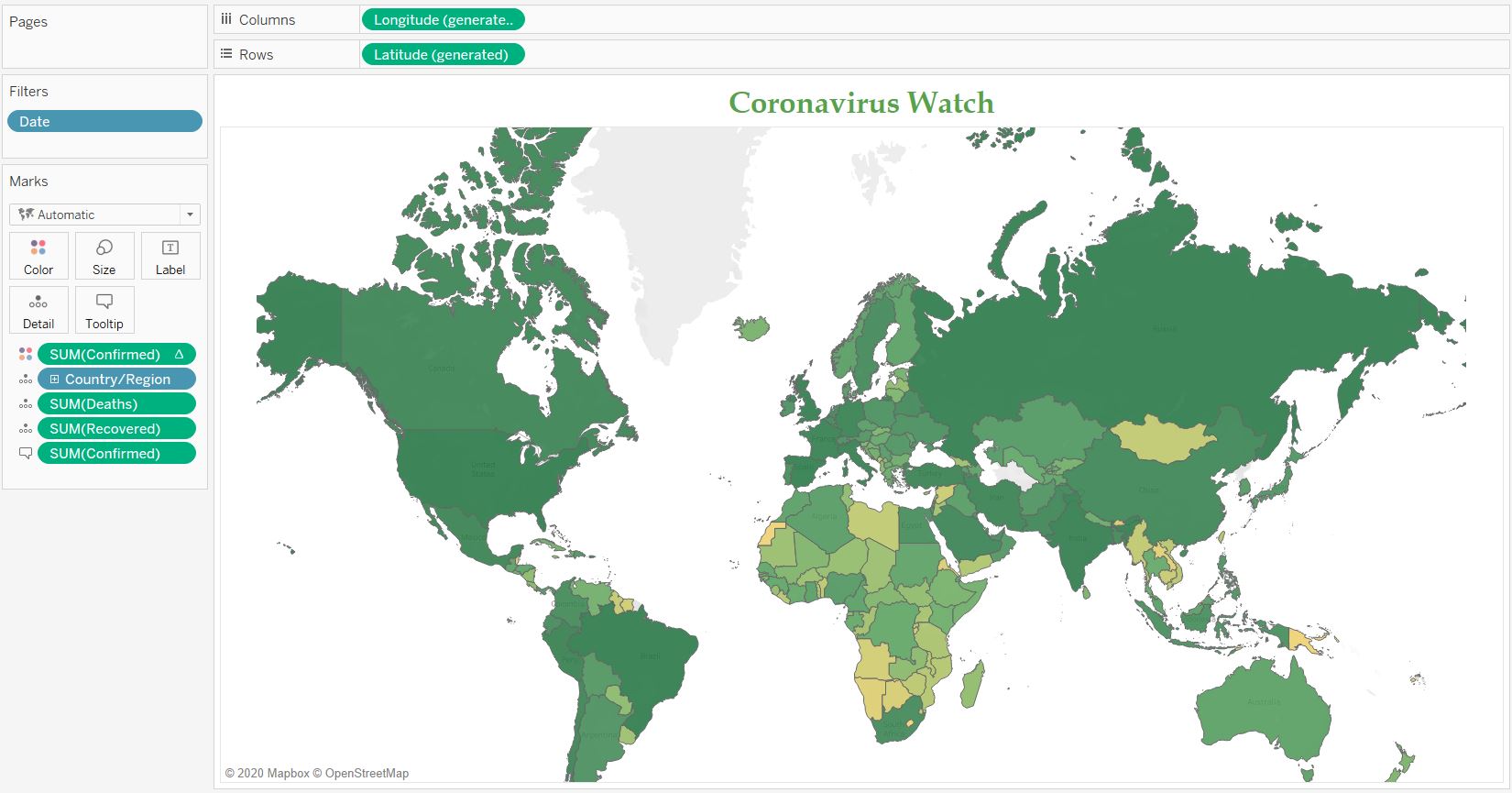
The first and foremost layer that will be the cornerstone of this dashboard is the geographical mapping. The map will display the latest number of confirmed cases of the countries. I have played with two approaches: either using dots to represent the countries with sizes or colours to represent the infection number or choropleth maps with the colour to represent the infection. I have decided that using the choropleth is better because the dots can be misplaced or stacked for smaller countries and users might have a hard time to find these countries. Below is the setup of the columns and measures for my map worksheet.
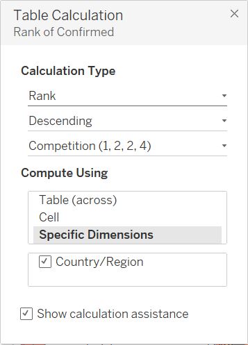
Someting to note, I have tried using the number of confirmed cases but the colour grading was not clear and seemed rather bleak due to a very high number of cases on one country. This means only one country with dark red colour and the others with similar light red. Getting inspiration from other maps, I have decided to change it into ordinal sequence based on the rank of the confirmed cases. Here is the table calculation to produce the rank.
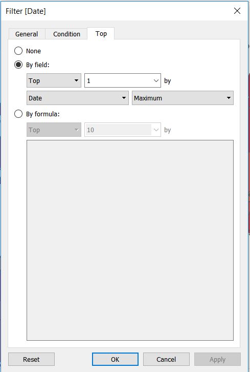
Now it is important to filter only by the latest/most recent cases, therefore I added a filter by the latest date to have this. Otherwise, you will have the sum of all cumulative cases from the whole dataset.
Daily New Cases (Tool-tip)
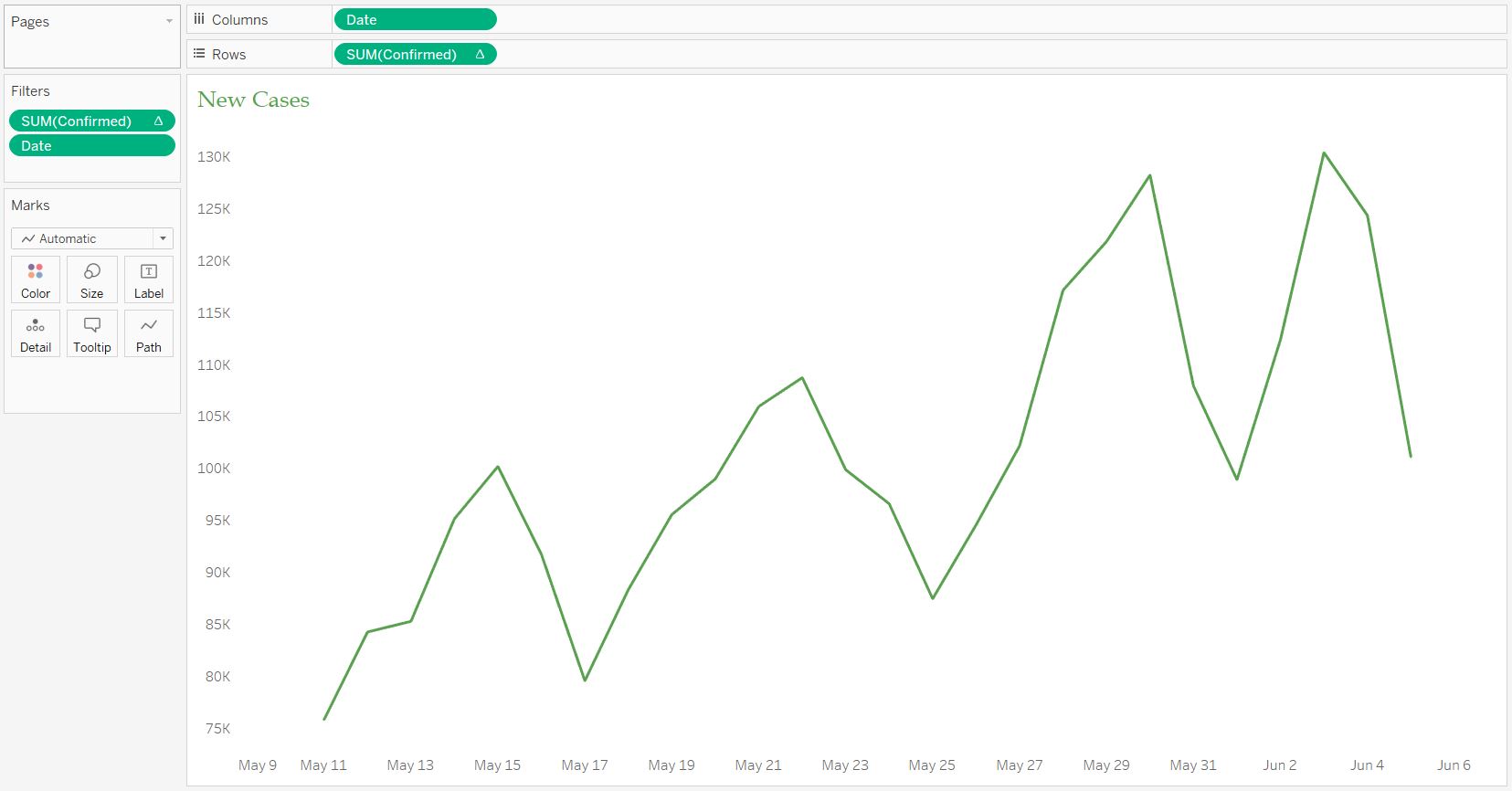
There is another layer I want to place in the tooltip of the main map. I want users to be able to see the daily new cases chart for the last 4 weeks. The screenshot below shows how I configure the chart.
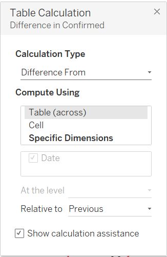
The measure is derived from a table calculation which is the difference of the confirmed cases from the previous day.
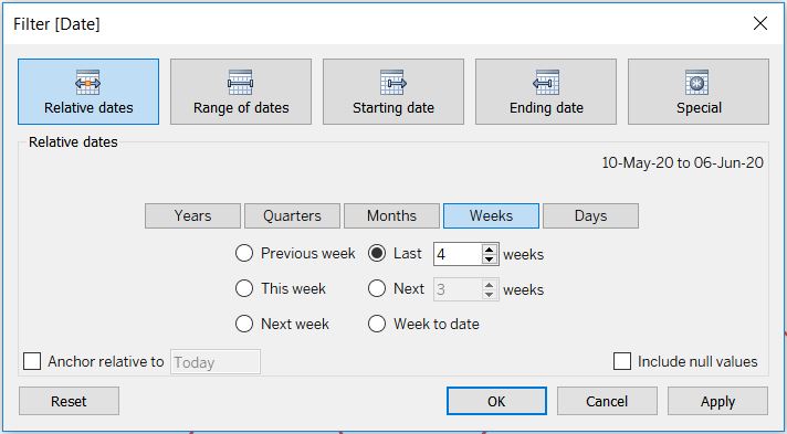
To make sure that we only have the last 4 weeks, I also created a new filter using the relative date.
After finishing up with the worksheet, we have to insert this on the tooltip of the main map. There is an option to “Insert > [Sheet Name]” so that the chart will show up when a user hovers on a country.
Highest Confirmed Cases
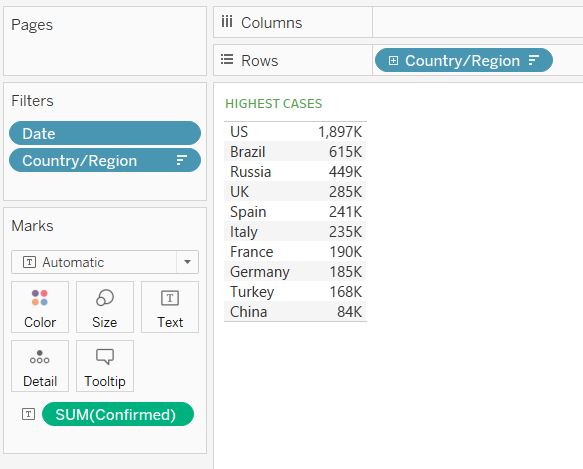
The next worksheet is the overall information of top 10 countries and should not be affected by the country filter on the dashboard. To create this layer, we just need to use the SUM(CONFIRMED) as a measure with the latest date filter (similar to the World Map). See the following screenshot for the guide.
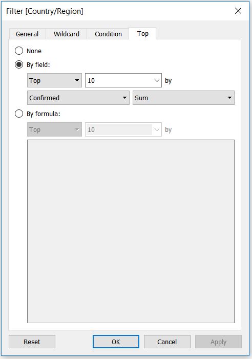
To only pick the first 10, I add the filter using the confirmed measure and only pick the top 10.
Highest Fatality Rate
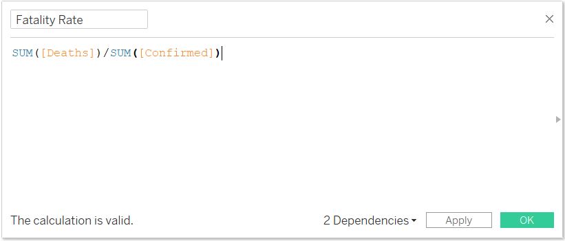
Instead of displaying just the number of fatalities by country like the confirmed cases, I want to show the fatality/death rate. This fatality rate is a relative measure of the number of deaths compared to the number of confirmed cases. Below is the simple formula to generate the calculation.
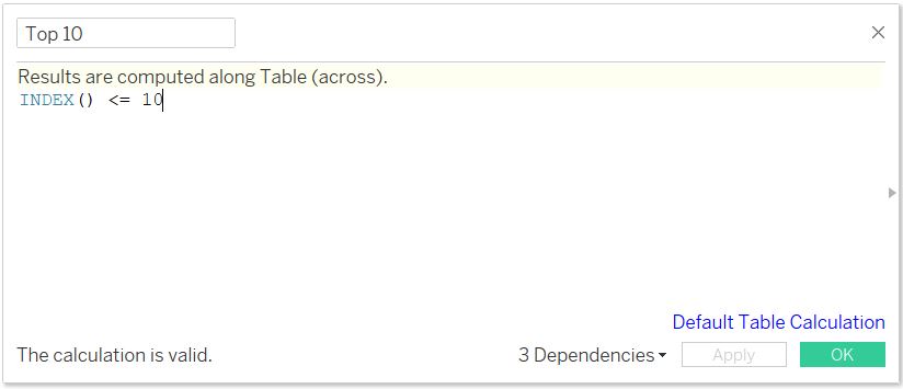
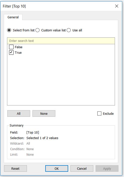
I tried to do the similar chart, however I can’t do simple sort and filter like before. Therefore, I decided to create a boolean measure that indicates whether the record is Top 10 or not. Here is the formula:
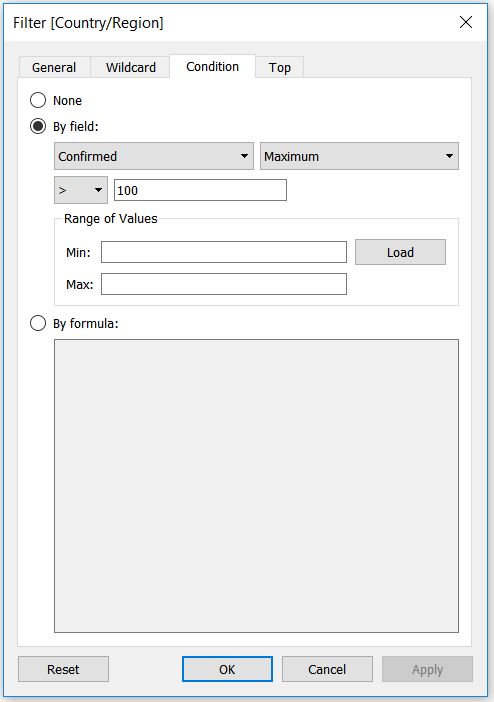
I also filter the countries showing in Top 10 if they have at least 100 confirmed cases. This to signify the fatality rate measure for countries with higher number of cases. Obviously, 100 is arbitrary so this can be changed as required.
Afterwards, after putting the measures together, I filtered the records in the table based on the Top 10 boolean variable.
Highest Recovery Rate
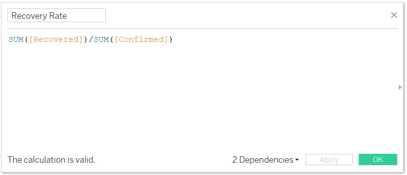
Similar to death/fatality rate, I created a recovery rate which is the number of recovered divided by the number of confirmed cases.
Since we have created the Top 10 boolean measure, we can reuse the filter alongside the at least 100 confirmed cases filter.
Confirmed Chart
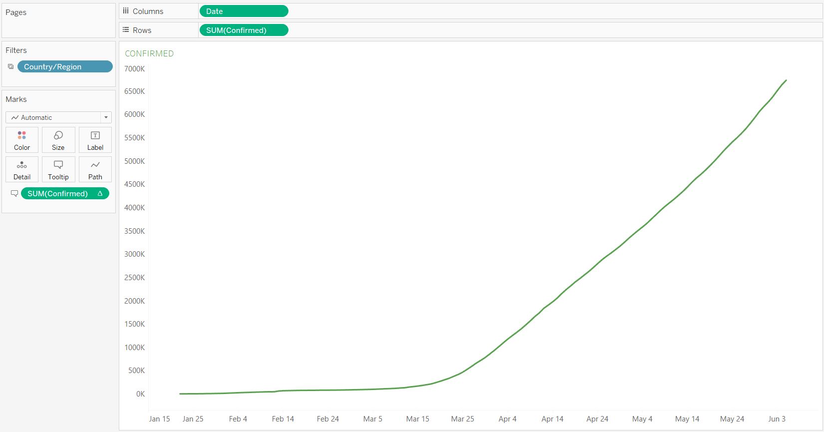
The next component is the time series chart of cumulative confirmed cases. It’s a simple line chart with the date on x-axis/column and the confirmed on y-axis/row.
Fatalities Chart
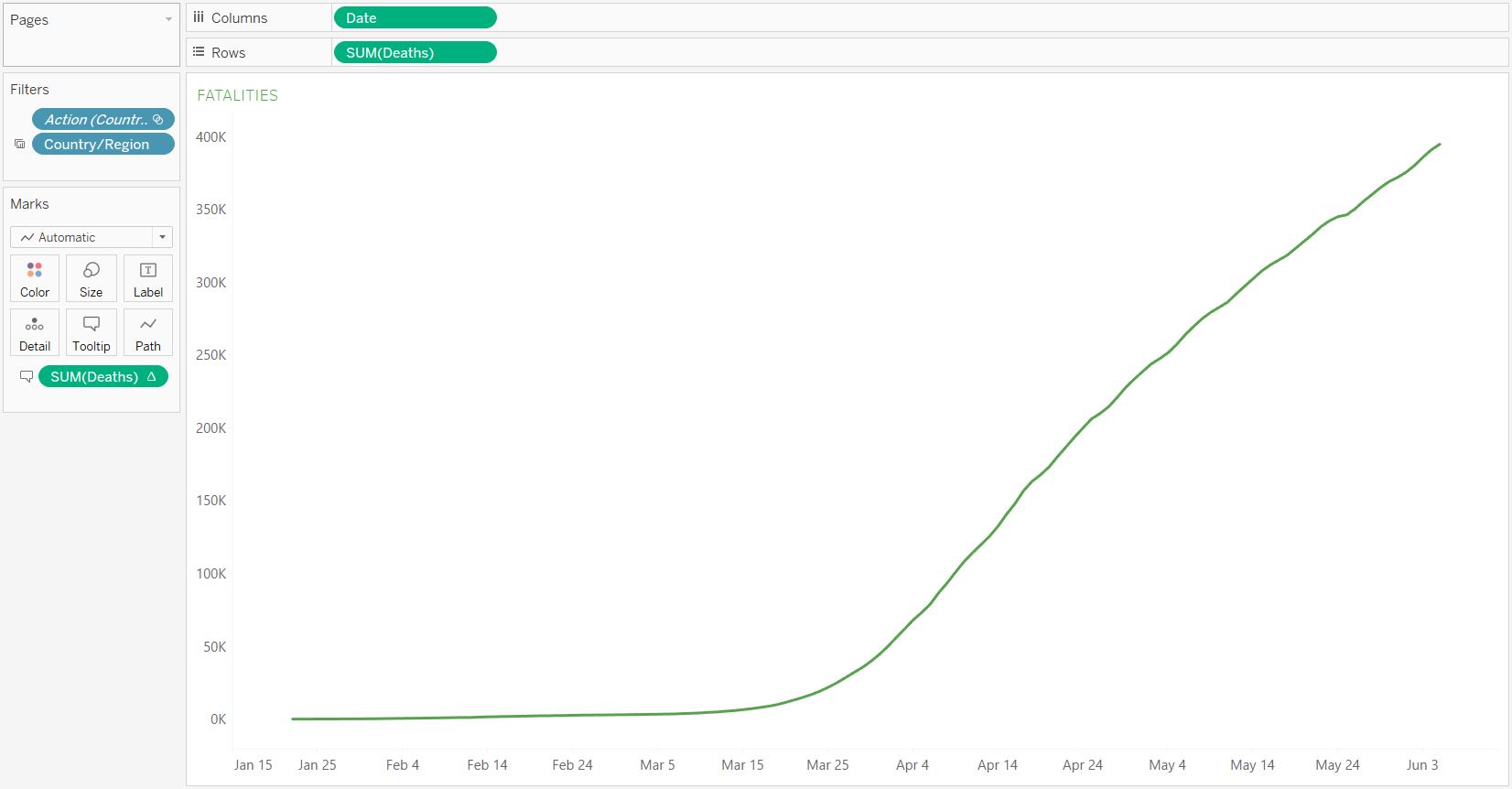
Similar to the confirmed chart, we can copy-paste the previous worksheet and create the cumulative fatalities. Again, it’s a simple line chart with the date on x-axis and the deaths on y-axis.
Recovered Chart
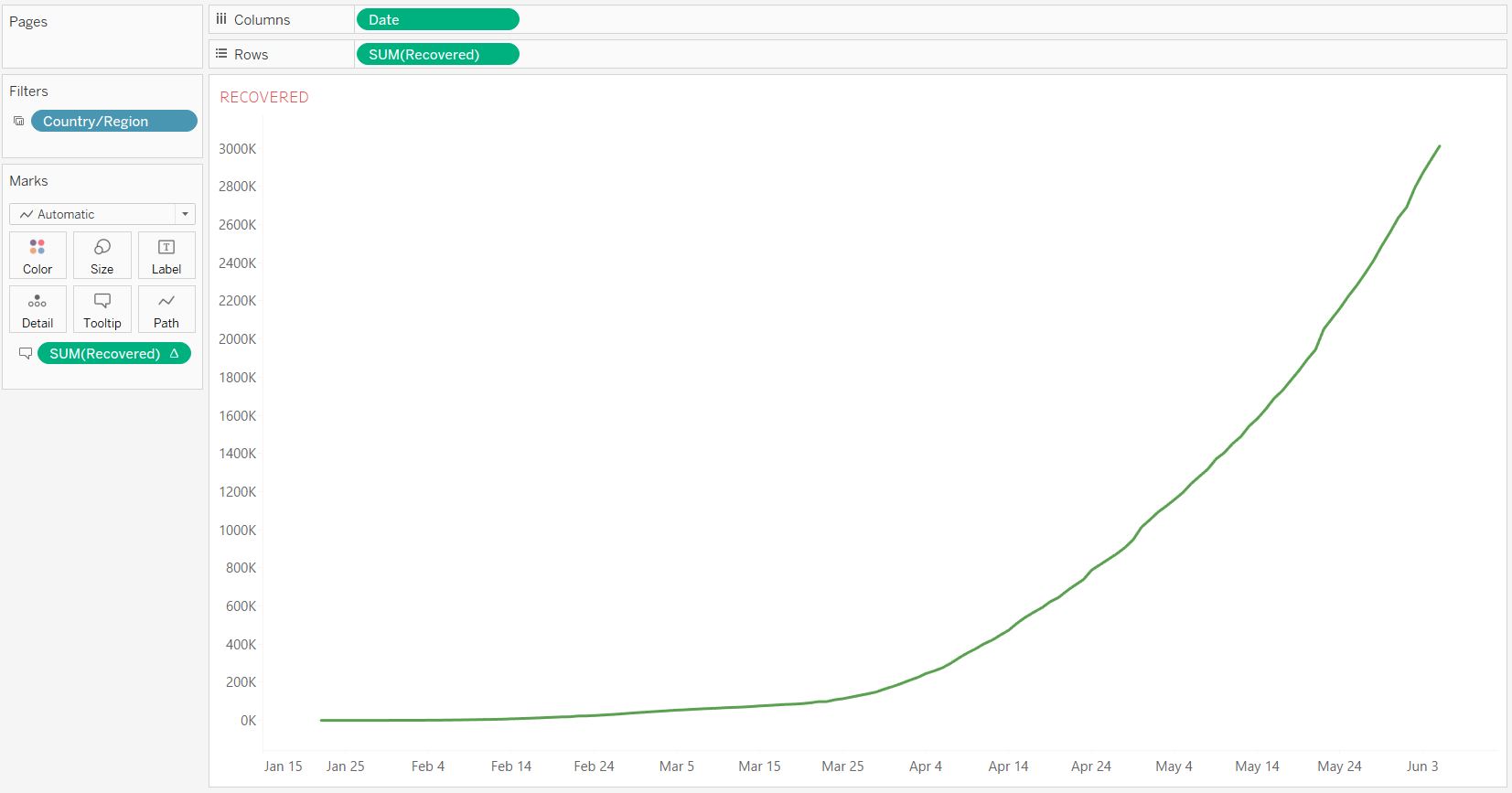
The recovered chart is again the same with the previous two. Here is the setting.
Country Selection
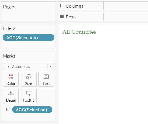
Finally, I create a worksheet to show the country selected from the map or filter. This just acts as a label for users to see which country’s statistics are displayed on the dashboard.
Final COVID-19 Dashboard
From all the worksheets, it’s time to build the dashboard. You can create multiple designs based on the device or size: desktop, tablet, or mobile. I created three designs as well. Also, before finishing off just make sure to use the map worksheet as the filter for other worksheets, except for the top 10 confirmed, fatality rate, and recovery rate. The final result of the dashboard can be seen below or through the link.
I think it looks pretty good and could give me some helpful information about the development and basic statistics of the COVID-19 around the world or by country.
